Water Permeability Statistics
I’ve processed all the images used in the water permeability studies and found the following statistics from these images:
- Mean Diameter
- Mean Area
- Median Diameter
- Median Area
- Porosity
- Area Weighted Diameter
- 90th percentile Diameter
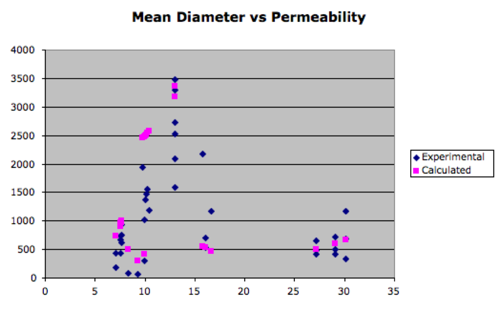
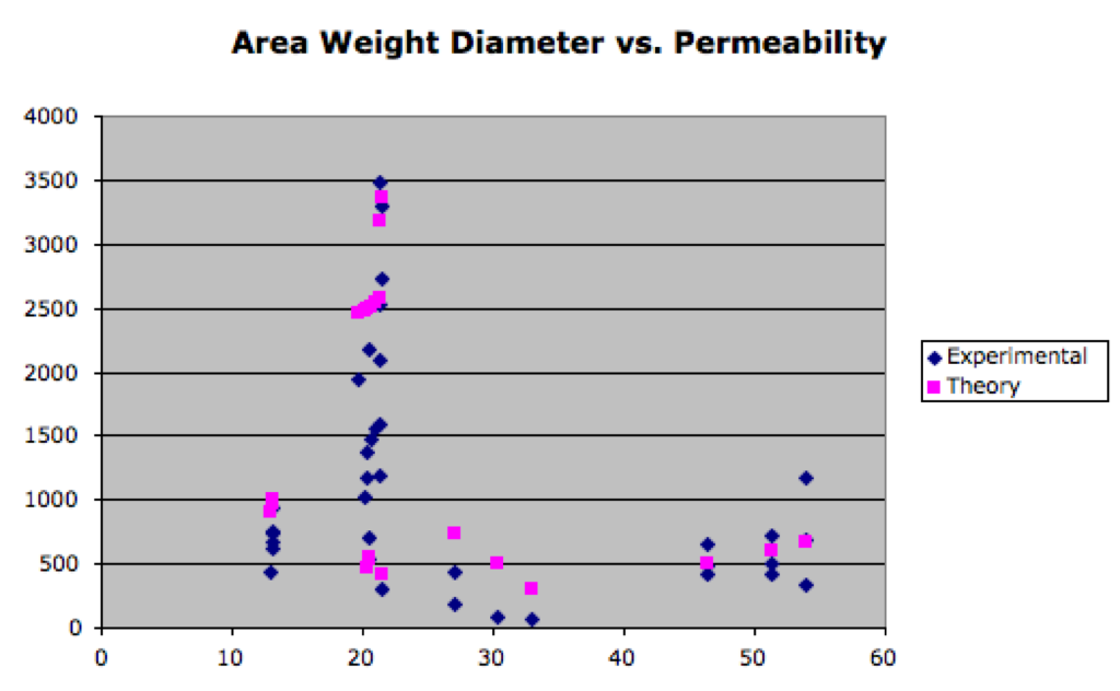
I calculated the theoretical water permeability for each sample we’ve used and compared that to the experimental permeability using these statistics as a comparison. In other words, I’ve plotted charts for Mean Diameter vs. Permeability, Mean Area vs. Permeability, etc. Here are a couple of selected ones:
Mean Diameter vs. Permeability
Area Weighted Diameter vs. Permeability
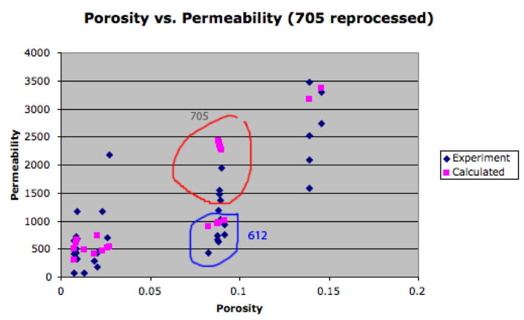
Porosity vs. Permeability
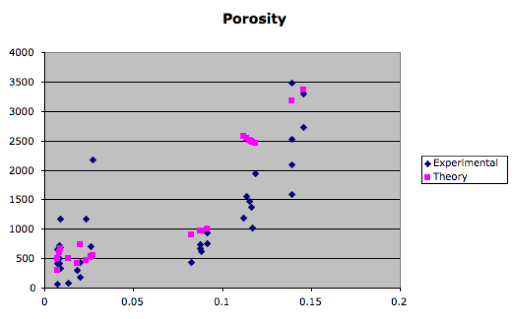
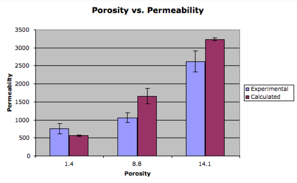
It looks like porosity is the best fit from this analysis, but it’s not as nice looking as Maryna’s data. Here’s a bar graph that might be a slightly better depiction of Porosity vs. Permeability:
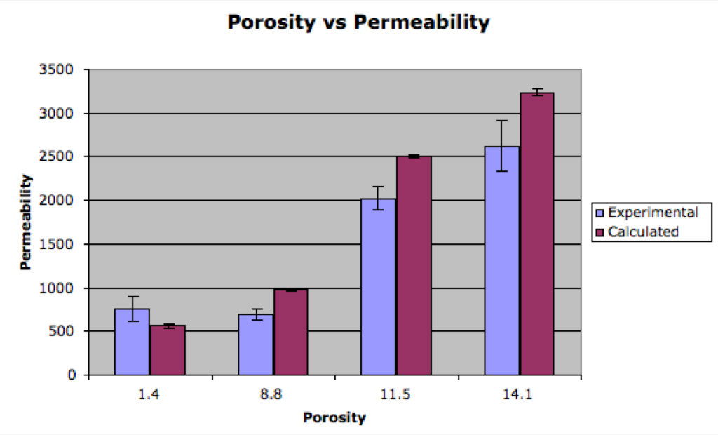
There’s a little wiggle room here depending on how you pore processes things, so I’m going to take a look at w705 in particular (in the 8% range) and see if changing my method affects how the calculated theory stacks up against the experimental. More to come as soon as I get a little more time!
UPDATE:
So I went back and re-processed w705 (there were a lot of background pores using my regular method). The porosity dropped from 11.5 to 8.8. If you look to the bar graph above, you’ll notice that we’ve already got a group at 8.8. However when I graphed the new values for 705, they were noticeably higher than the other 8.8% (w612). This means there’s definitely a two dimensional effect since 612 has an avg diameter of 7.5 and 705 has an avg of 13.5. Also the theory on 705 is still higher than the experimental, but it is closer after I reprocessed the image. Unfortunately because of the overlap at 8.8% and the two different populations, I’m not sure how nice this will look as a bar graph (lots more variability).
Bar Graph
UPDATE:
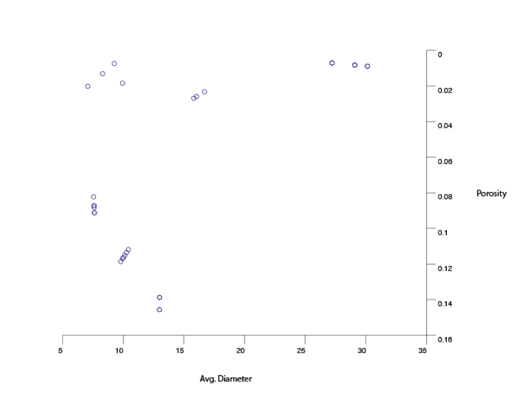
There doesn’t really seem to be as good as a trend with avg. diameter as there is with porosity. I’m not sure if these figures are very telling, but I’ll put them up anyhow.
Looking down:
3d Fig:
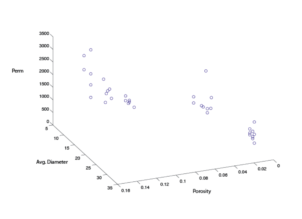
This is great! I think even if bar graph will end up looking like this it is still good.In the air graph there are some permeabilities higher for lower porosities too.
Lets see the bar plot anyway (w/ standard error).