Resistance comparison
In this post I look at our membrane resistance and compare it to the best performing alumina membrane.
Here is the resistance figure I made for the paper:
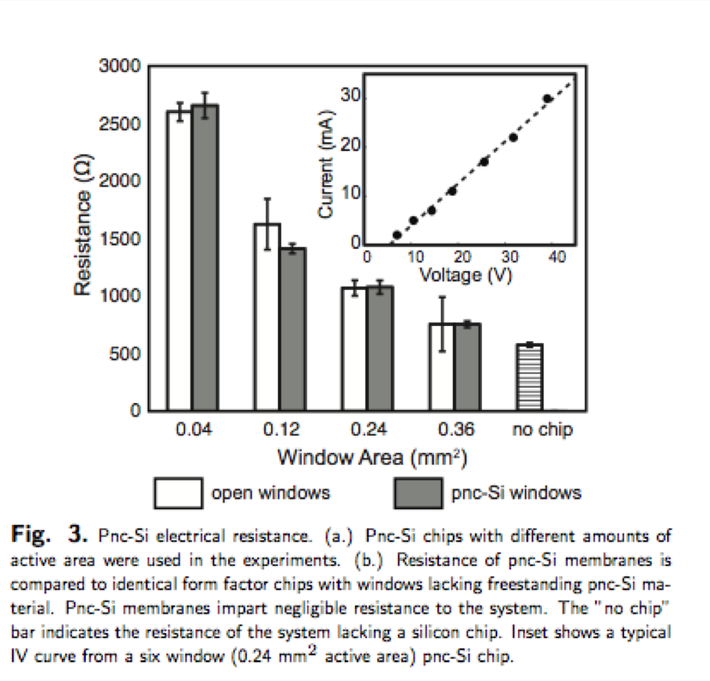
This figure shows the device resistance with and without a membrane. The membrane resistance would be the difference between the white and grey bars. We would like to know evaluate the average membrane resistance, which I’ve tried two methods and would be interested in what people think is the most reliable. The first method was to take the average standard error of the bars, as the difference will fall somewhere between the error bars. This method provides a resistance of 70 Ω. The second method was to take the average of the difference between the bars. Because of the error and the closeness of the measurements, some of these differences are negative. This method produces a resistance of 40 Ω.
I used this figure to compare to alumina membranes:
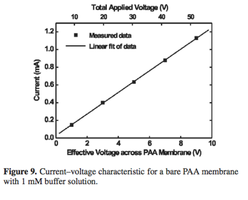
The slope of this figure gives a resistance of 8000 Ω. This resistance is on par with the entire resistance of our chamber. One interesting feature is that they run their experiments at a very low currents, .1 – 1 mA compared with our 10 mA. Our experiments are run at similar voltages to theirs, but because of their higher resistances, they get much lower currents. Though it is important to mention that they are getting high flow rates at these currents and it would be interesting to see if we can get good flow at low currents also. This membrane is a 6.35 mm diameter circle, so it has very high resistance for even a larger active area than our experiments.
Here’s a look at resistance versus active area. All points are the resistance of a system with a broken membrane minus the resistance of the system without a chip.
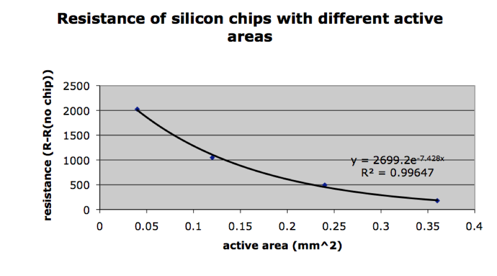
I originally thought this was a decreasing exponential, but the more I look at it, it could be linear with slight outliers. Resistance in a wire is inversely proportional to the cross-sectional area, so shouldn’t that be the same for us?