Graphs of IgG, qDot, and water passage for conjugated qDot preparations for Life Tech
Here is a graphical summary of the separation experiments performed the week of November 6th. Raw excel data is spread over 5 files:
11.4.14 qdot separations (10^13, 10^12, 10^11 Forward separations)
11.5.14 high conc reverse and forward (10^14 dots and IgG combination forward and reverse separations)
11.10.14 (retentate numbers for all separations)
summarized qDot data (summary and graphs)
11.5.14 low conc reverse (10^13, 10^12, 10^11 reverse separations)
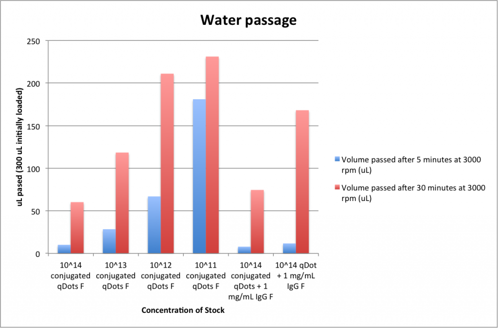
Here are the graphs I generated:
‘F’ refers to forward configuration filtration, ‘R’ to reverse.
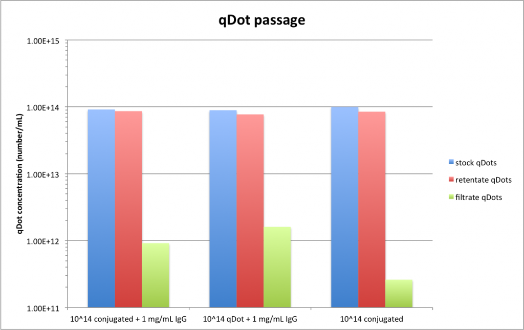
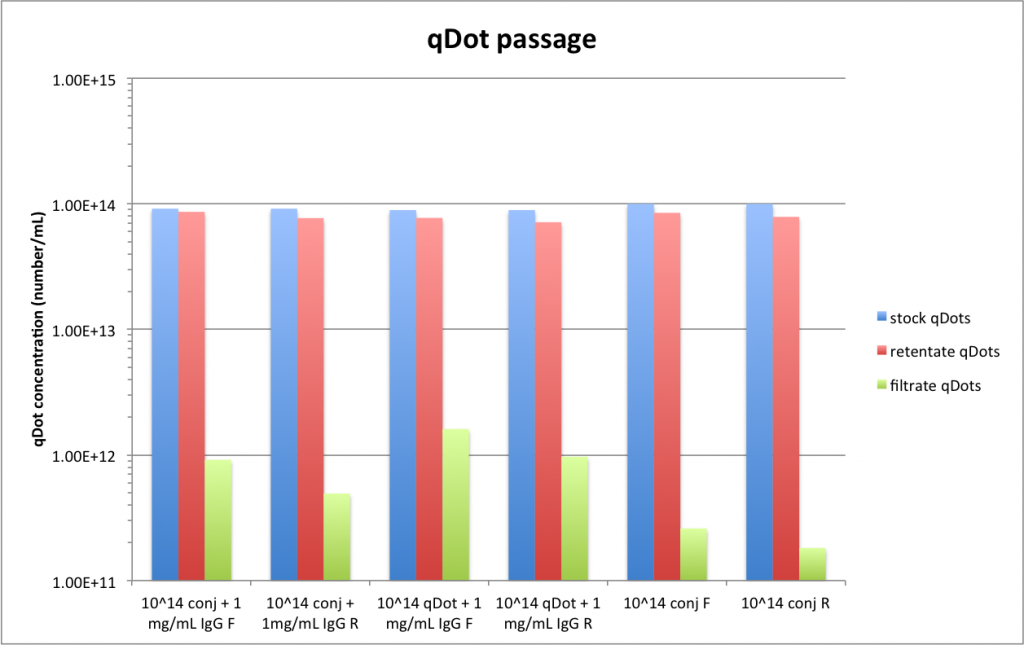
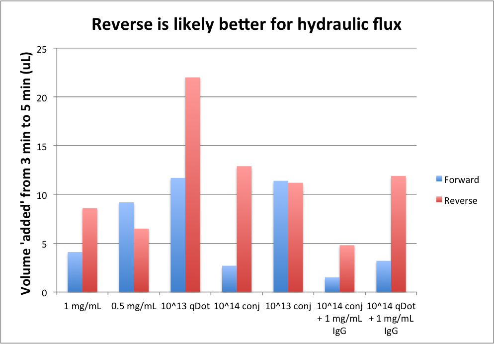
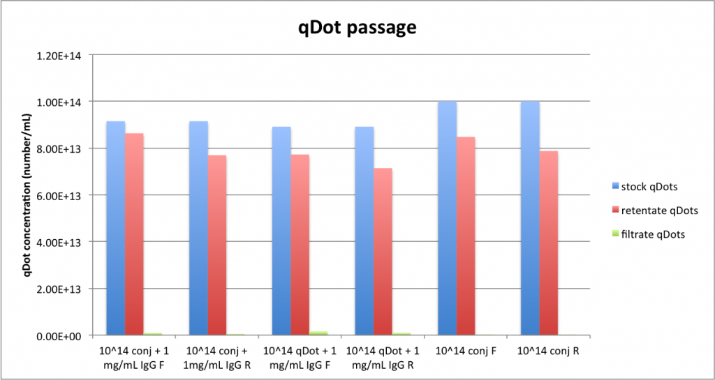
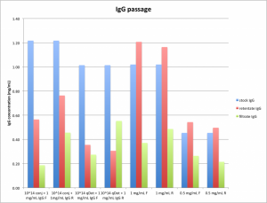
Yield numbers and purity numbers give us some reason to question these figures, since we seem to be magicking protein into existence:

IgG concentration determination is difficult for the complex mixtures. At around 10^14 particles/mL, qDots begin to affect the absorbance at 280 (buffer signals have been subtracted from all pictured curves) :
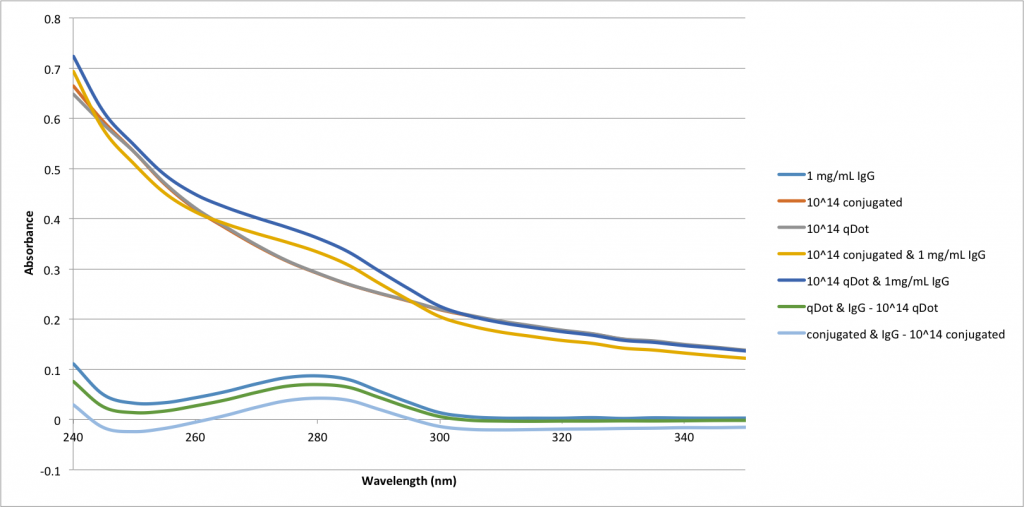
Fortunately, as pictured, if you know the concentration of qDots you can subtract out the qDot absorbance and get some idea of the IgG concentration. If you center the graphs around 250 nm, 280 absorbance gets even more reliable:
Next I made standard curves for qDot and conjugated absorbance at 250 and 280:
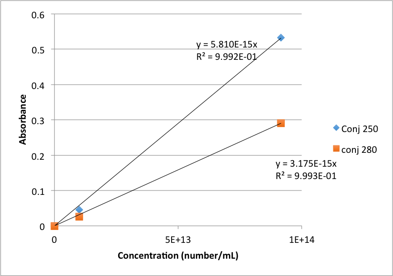
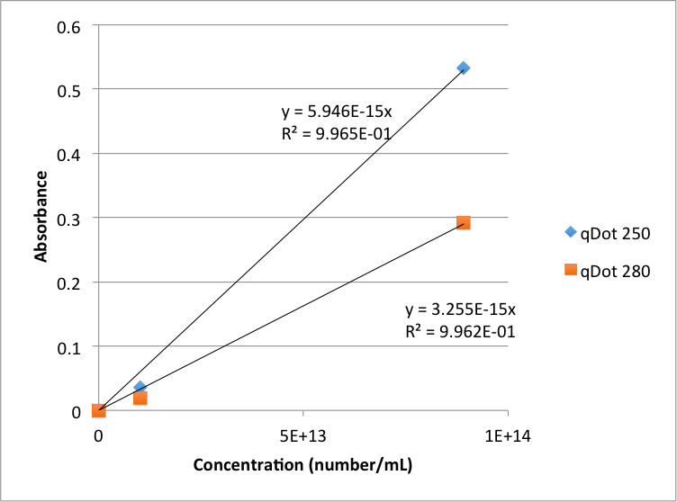
I then used fluorescence data and the above standard curves to calculate the expected qDot contribution at 250 and 280 for all qDot + protein mixture retentates and stocks, and then subtracted that from the actual absorbance. Finally I subtracted 250 absorbance from 280, and using another IgG standard curve based on absorbance of PBS, 0.5 mg/mL IgG, and 1 mg/mL IgG, I calculated IgG concentrations for the stock and retentate solutions. For everything else (everything that didn’t have both dots and IgG) I used a straightforward IgG curve for concentration calculations.