Gel Analysis
We have recently been discussing the best way to analyze the diffusion and SepCon separation gels. In the following figures, I present line scans of the gels. These appear to be a bit noisy and are somewhat misaligned due to variations along the length of the gel.
Blue = Control, Green = Retentate, Red = Filtrate
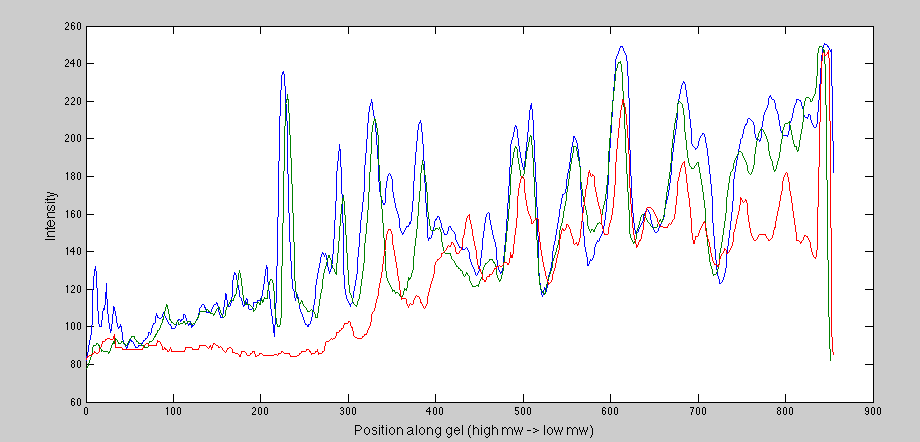 This is the SepCon gel. You can see the retentate follows the control, as it wasn’t really depleted by the spin. The filtrate starts out with no protein, and then you start to see the lower molecular weight species in it.

This is the diffusion gel. I’m not sure why the retentate is higher than the control at first, but you can see that very few of the small molecular weight species remain in it. The filtrate though tends to follow the control, and from this it’s hard to visualize where the cutoff is.
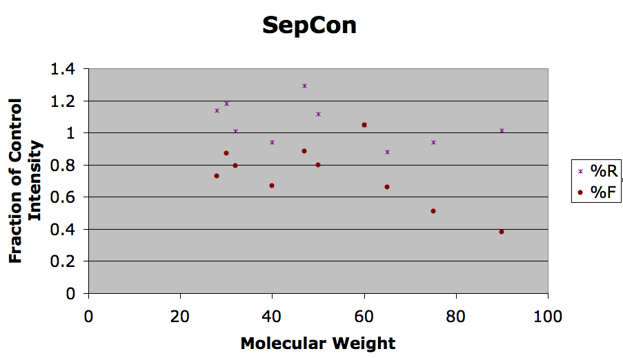
One idea would be to produce a more discrete scatter plot of the most important bands in the gel. In the next image, I tried to make a discrete plot that normalized the retentate and filtrate to the control intensities. This is not a very clear or useful image. If anyone can suggest other methods of plotting or normalization, I’m all ears.