Journal Club- Characterization of ultrafiltration membranes fouled by quantum dots by confocal laser scanning microscopy
Here’s the paper we’re discussing this week:
The authors motivate their work by claiming that ultrafiltration membranes can be used to keep “engineered nanomaterials” (ENM) out of our waters. They use confocal laser scanning microscopy to locate the position of fluorescent CdTe quantum dots (QD) on/inside an Ultracel membrane. (Made by Millipore using regenerated cellulose).
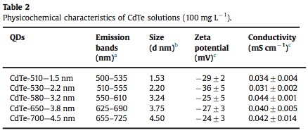
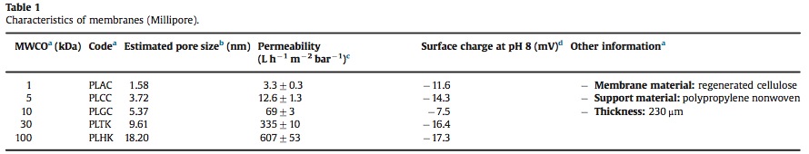
Here are two tables summarizing the 5 QD sizes and the 5 membranes used:
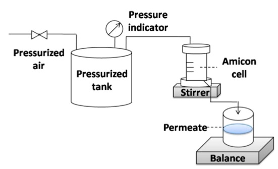
They pressurized the filter using compressed air and also agitated the retentate side of the filter with a stir bar. They test two transmembrane pressures: 2 bar (29 psi) and 0.6 bar (9.4 psi).
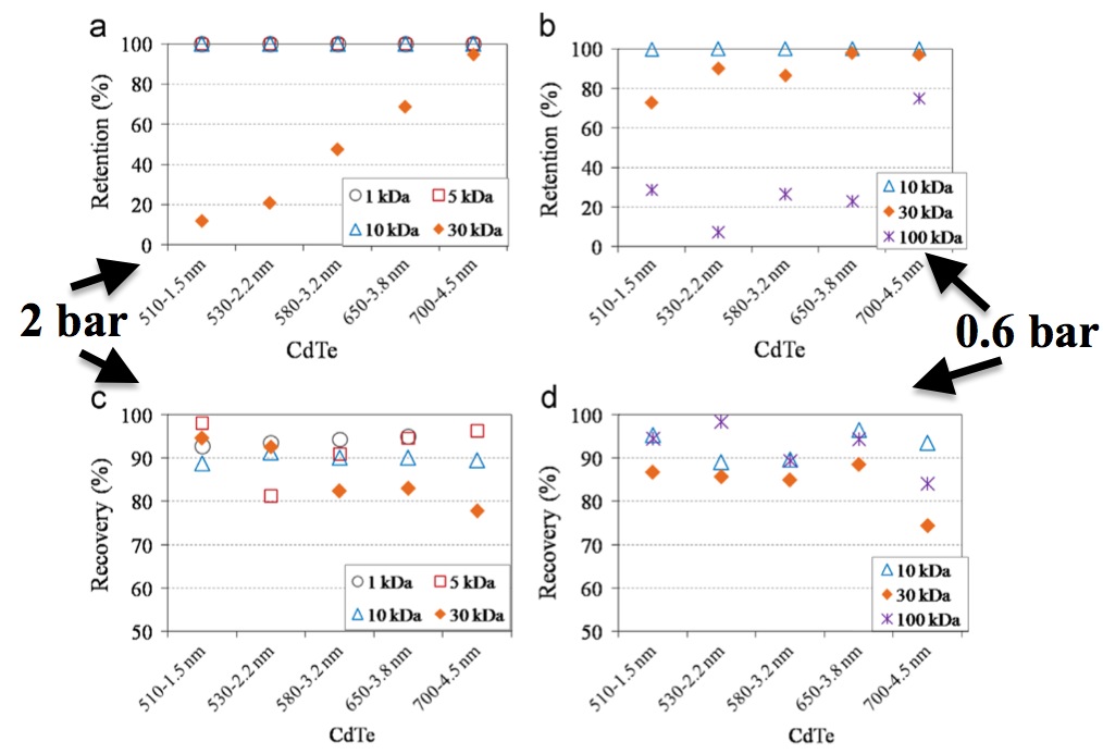
The authors say TMP has a clear effect on retention:
“…retention of QDs by 30 kDa membranes was largely influenced by the TMP applied. It can be seen that retention efficiencies at 0.6 bar were higher than those at 2 bar during 30 kDa filtration. Meanwhile, the difference between these two retention efficiencies generally diminished as QDs sizes increased. For example, by comparing retention efficiencies in 30 kDa filtrations under two TMP, 61% difference was found for CdTe-510, but almost the same values (only 3% difference) were observed for CdTe-700. ”
They then say there is no clear trend in recovery based on TMP difference.
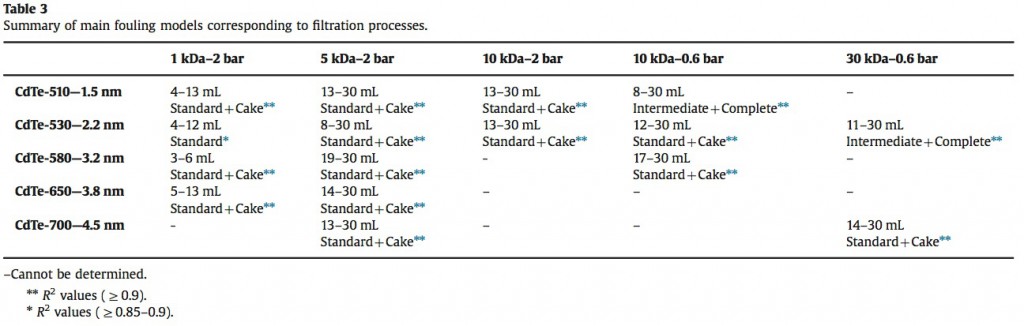
They worked on matching the fouling they saw to theoretical models. Below is a table of their results. Interestingly, they pointed out that the the R^2 value needs to be 0.99 , “According to El Rayess et al. [23], R2 values should be greater than 0.99 to confirm the model fitting.”, so none of this table meets their own threshold. I don’t really understand why they bothered to include this table.
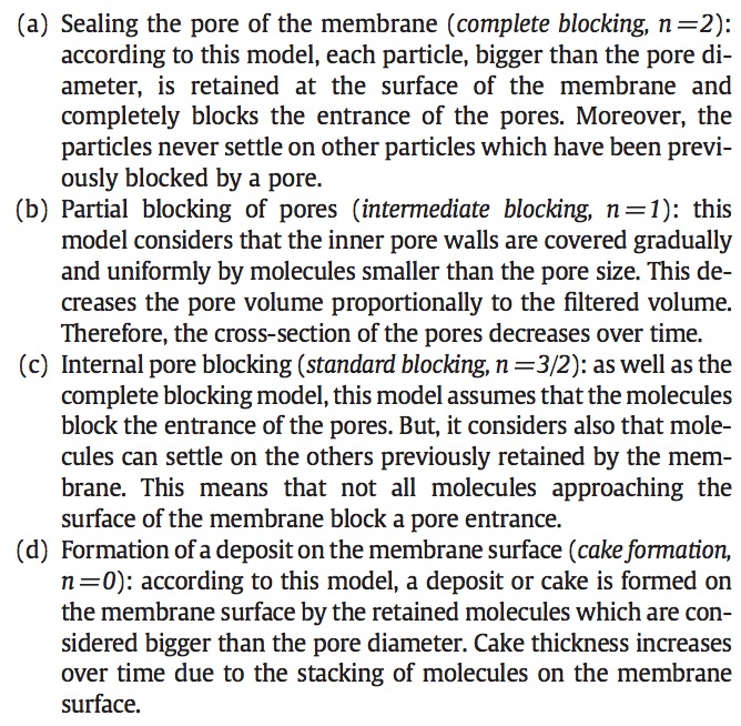
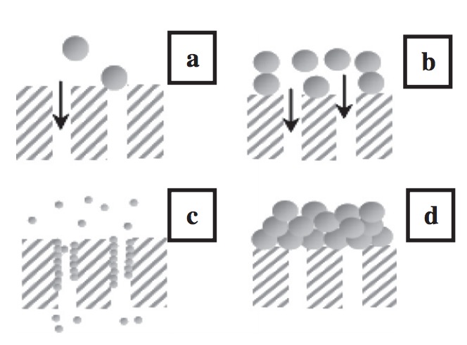
*****One of the cited papers (Analysis of membrane fouling during cross-flow microfiltration of wine, Rayess_2012) has some schematics and explanations of the fouling models:
Next they report a series of CLSM images which I did not copy into the post. But below is an example image and the corresponding data analysis they performed. Red is the membrane, green represents QDs. If I understand this correctly, the membrane area is 1.1 x 1.1 mm^2 while the thickness is 50-100 um. The large square represents the top face of the membrane and the rectangles on the right and bottom are cross-sections taken at the positions of the two lines drawn on the top face.
They used two methods to locate the QDs in the membrane: “mean” intensity and “point” intensity. “mean” intensity is the intensity of QD signal across and entire slice of the membrane and is plotted in b. below. I’ve read their methodology several times and I’m still confused. But they clearly state that the bulk of the QDs are “outside the 1 kDa membrane.” It looks like they are 10 um outside the membrane, which is confusing me a lot. The resolution they claim along the z-axis is 7-8 um.
The point intensity method choses regions to map intensity more narrowly and the authors claim it agrees with the mean intensity.
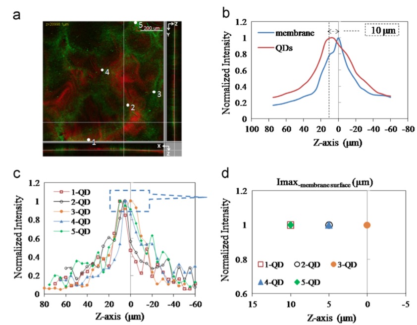
Next is the comparison of multiple mean intensity plots. Sample size is 4-6. I have a difficult time correlating what I expect to see in these plots to what I’m seeing. I’m not sure if it is only the peak location that matters, or if we should also pay attention to the shoulders. Also, shouldn’t we expect the intensity to go to 0 at some point?
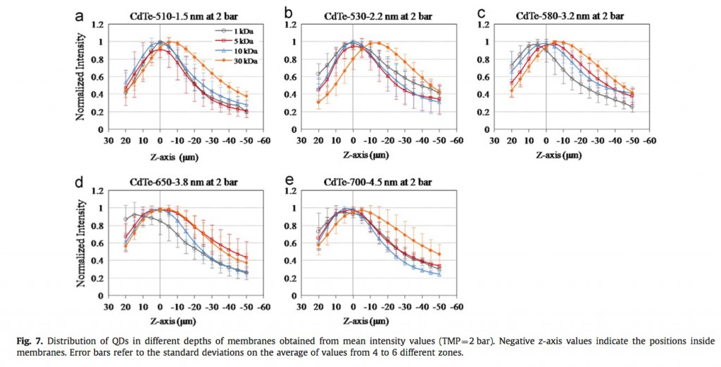
They give more iterations of these mean intensity plots that I find equally confounding.
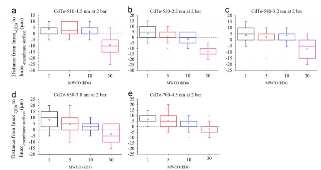
Next they provide the results of point intensity analysis which shows a slight (and barely statistically significant) difference for QD location along z-axis of membranes. Larger MWCO membranes have higher concentration of QDs farther inside.
In summary, there is a lot of interesting data in this paper, but I’m often frustrated by the lack of clear trends in the data. Definitely worth citing in our papers because it does clearly showing clogging in the depths of the membranes, a problem we don’t have!