3 vs. 4 bars
I guess there was a mistake in the last permeability plot. The real data for the 4 bar plot should look like this:
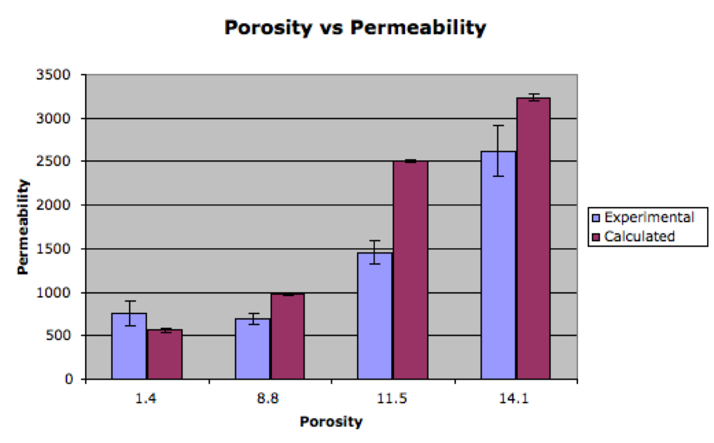
Unfortunately that doesn’t look so good anymore. The third bar though is the one that I originally processed to have many more pores (w705). The reprocessing gets it down in the 8% range and the new plot looks like this:
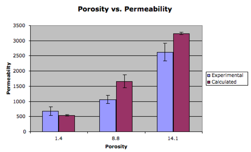
This is more reasonable. Removing data from retests (which has been done here) doesn’t affect the overall chart much.
Three bars then.
What is the message here? I look at these graphs and conclude that more porosity increases flow rate in a non-linear fashion. If this is the message, I think this is fine. However, are the pore sizes the same at each porosity? Will this be included in the caption?
Right there’s some dependence on pore size too. I haven’t had much luck with a 3-D figure to illustrate this. We’re trying to use this as a comparisons to Maryna’s porosity vs. permeability figure.