Water Permeability Figure
Here is the figure we talked about in the last meeting. For each specific membrane, I’ve plotted both the experimental permeability and the permeability calculated from the theory. You can see in some cases they are close, but in others they can be pretty far off. Omitted from this chart are retests.
Updated: Graph is ordered by Experimental Data (previously it was chronological). Lower figure shows Porosity in percent compared to Area Weighted Pore Sizes in nm on the same axis. Also updated to show pore densities (see x axis of permeability figure).
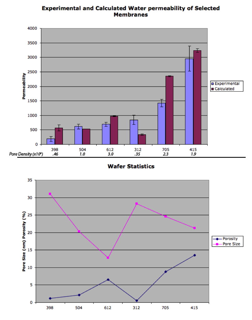
Here’s a plot of the porosity vs. the pore size for the selected membranes. I don’t think we’ve decided on whether we like to use mean, weighted, or 90th percentile pore size when we say pore size, so I’ve included all three.

In some cases, a low porosity can mean a big difference between the mean and the 90th percentile pore. Mean pore size doesn’t correlate well with the cutoff in most cases, but 90th percentile can be deceptive if there’s only one big pore. At any rate, I would say that pore size is independent of porosity in this case. Although whether we have fine control of making specific porosities and pore sizes is another question.
NOTE: 90% is the area weighted 90th percentile.
Purely aesthetic, but could we order least permeable to most left-to-right?
Also label each with porosity and pore sizes.
could you plot pore size vs. porosity? And what do you call pore size- average or maximum pore size?