Pore Processing (sorted by thickness and RTP)
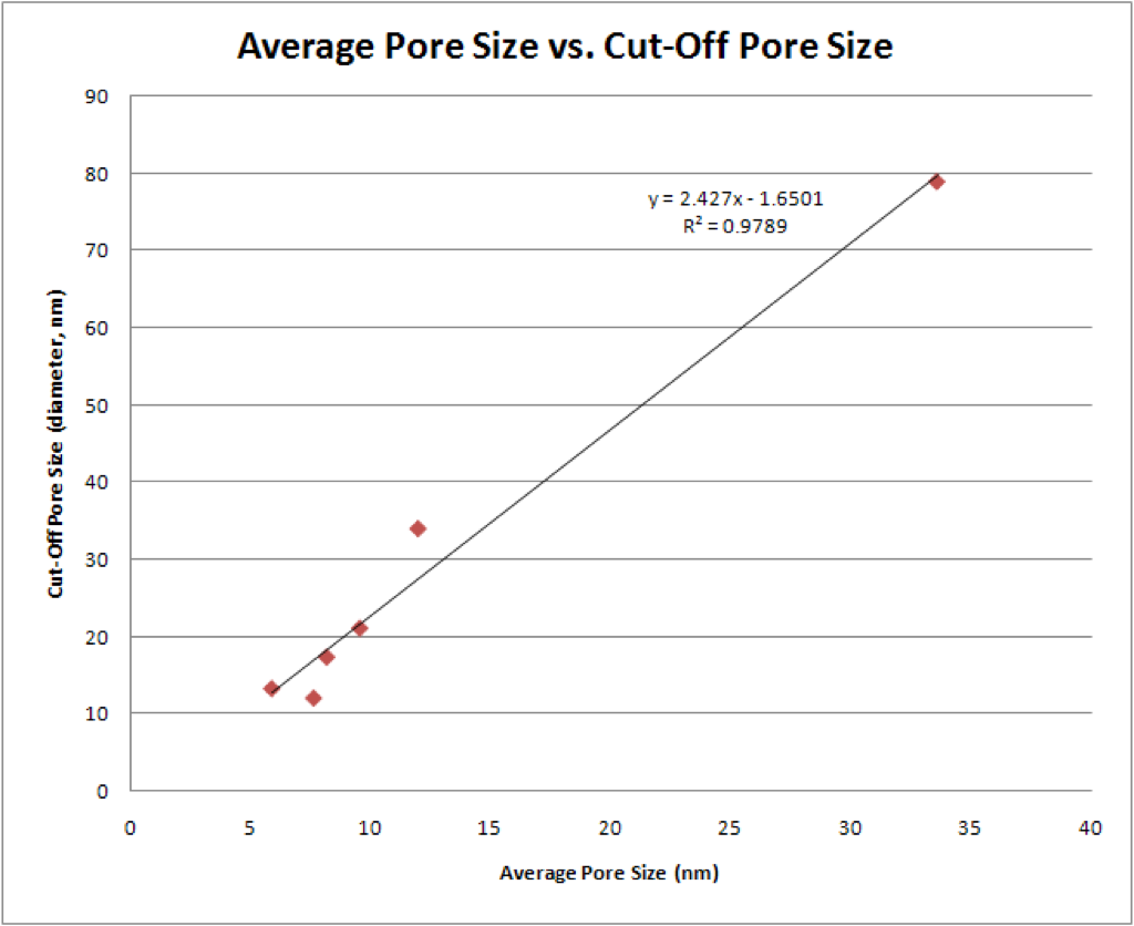
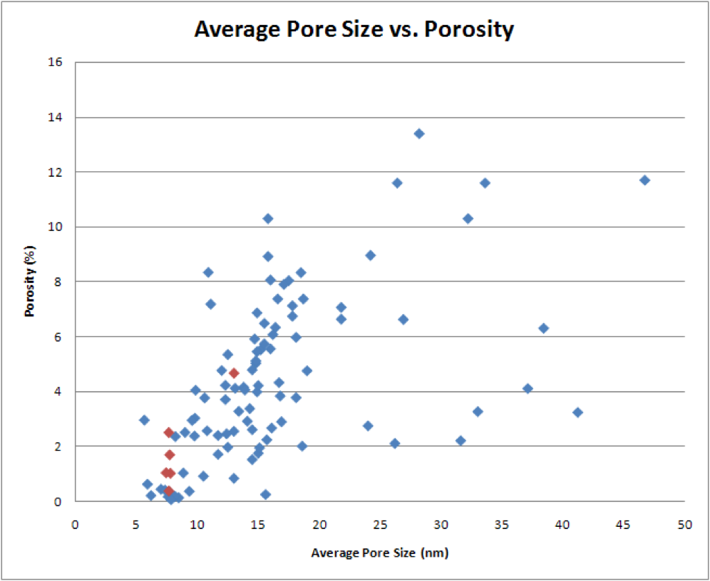
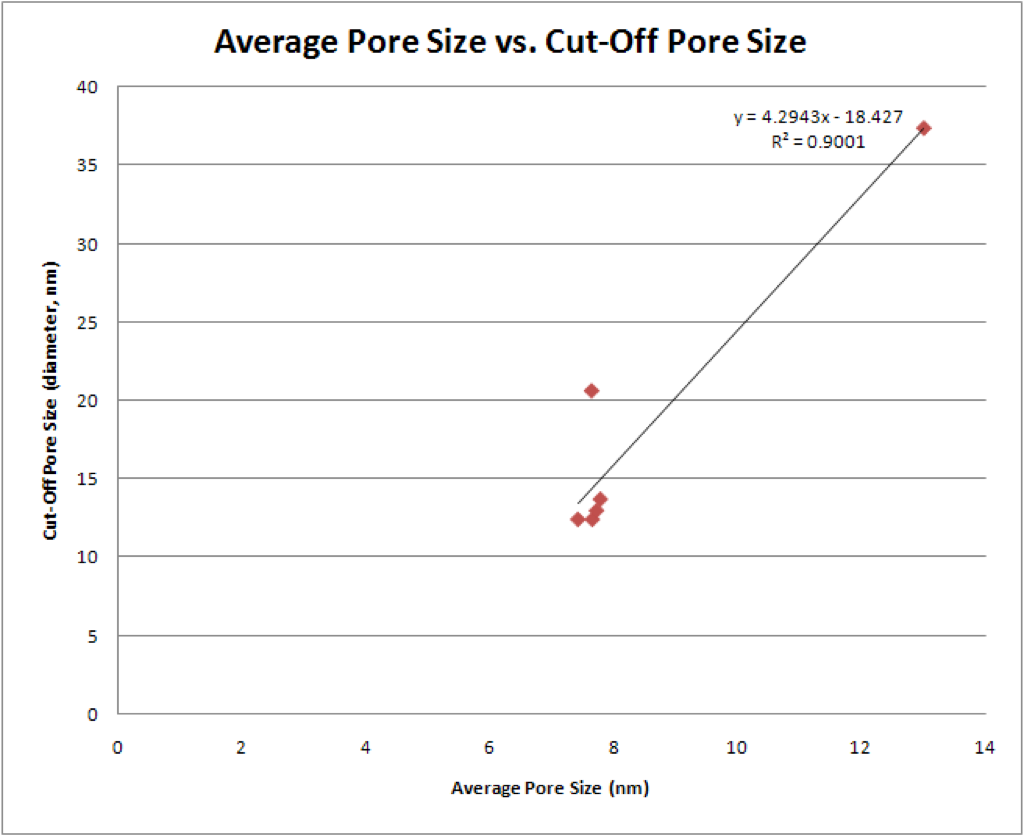
I went through and characterized each wafer by thickness and RTP. I graphed “Average Pore Size vs. Porosity” and “Average Pore Size vs. Cut-Off Pore Size” for each processing condition that had at least four representative wafers.
** Yesterday, Professor McGrath and I had a quick chat about the data. I have inserted a few of our comments.
*** As per request, I have also isolated each data set and added trend lines to see if any trends can be extracted.
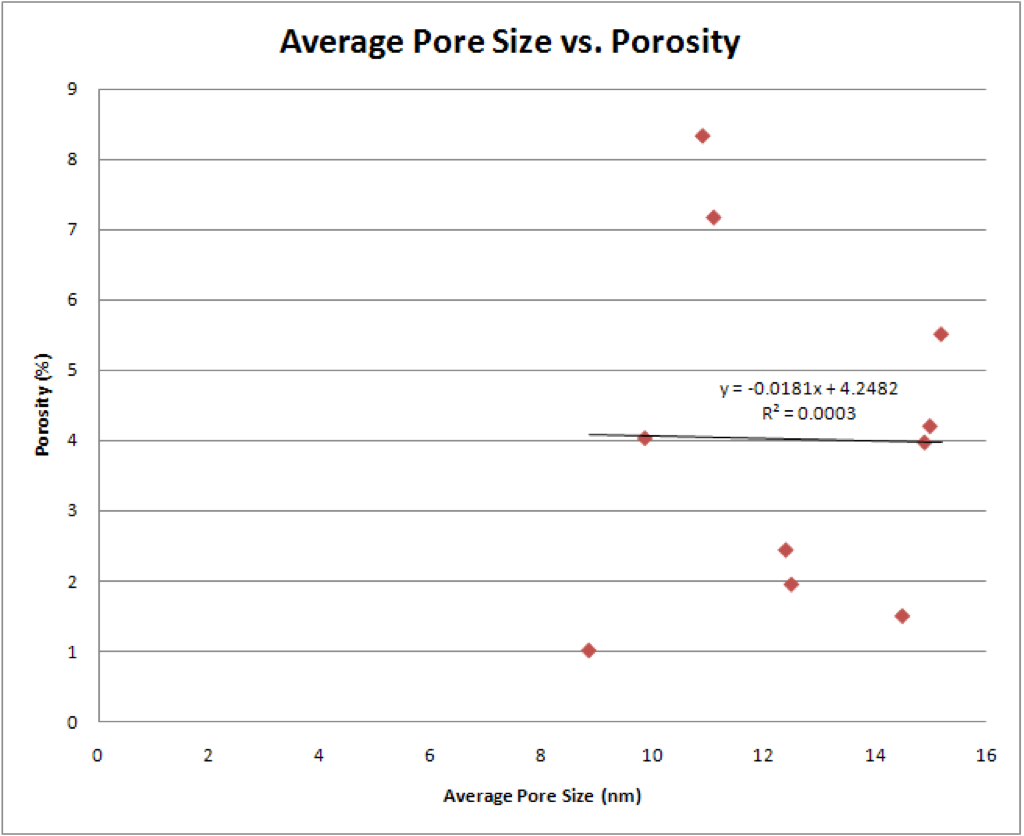
15nm, 700 RTP:
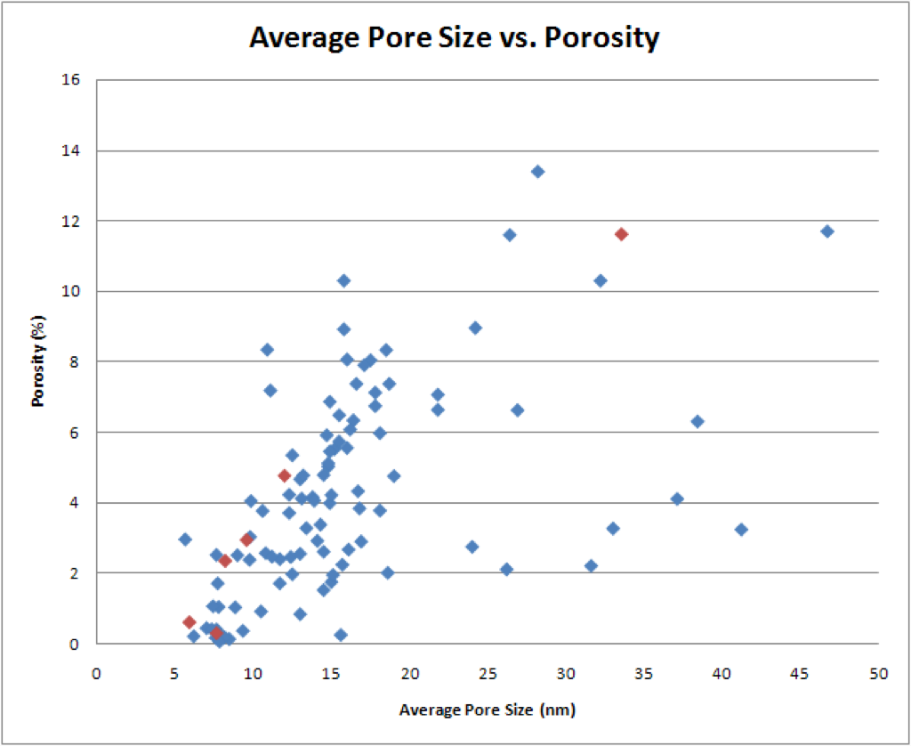

** These data points run right along the top edge of the data cluster.

15nm, 800 RTP:

** These are also pretty linear but they are a little further down.

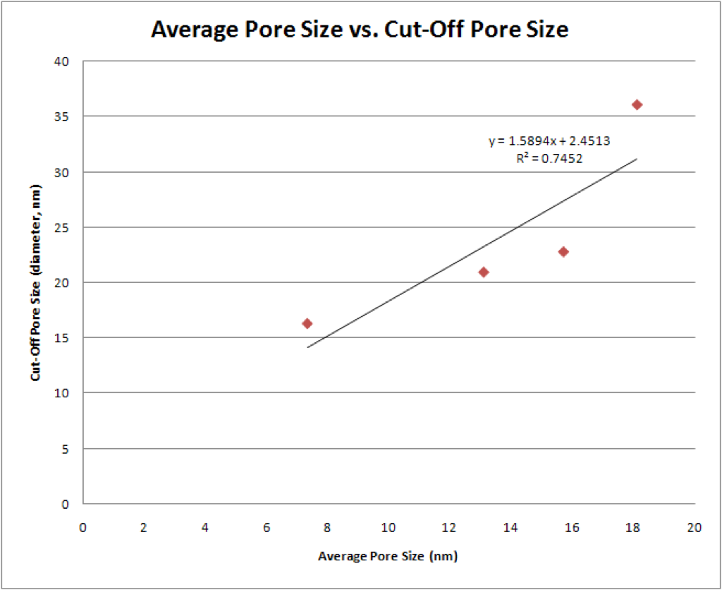
15nm, 850 RTP:


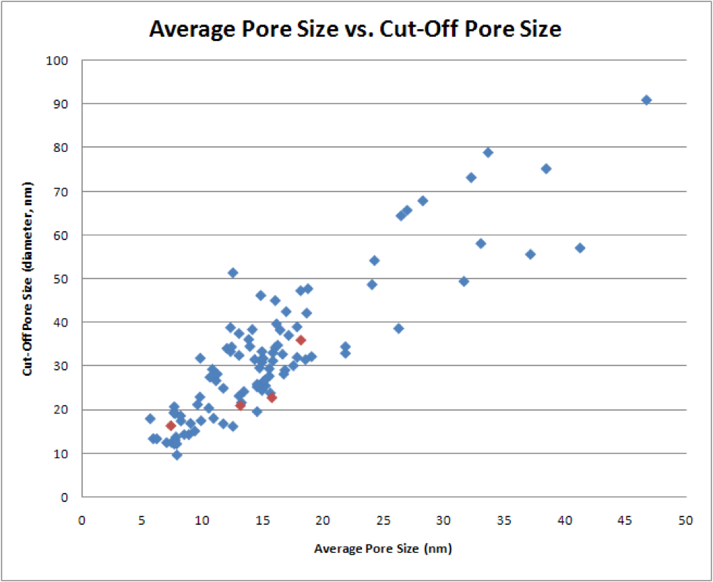
** These are not quite as linear. However, especially in the Average Pore Size vs. Cut-Off Pore Size graph, they are even lower.

*** The graph on the right did not come out like I expected. Any suggestions? I do not want to artificially set the intercept to zero.
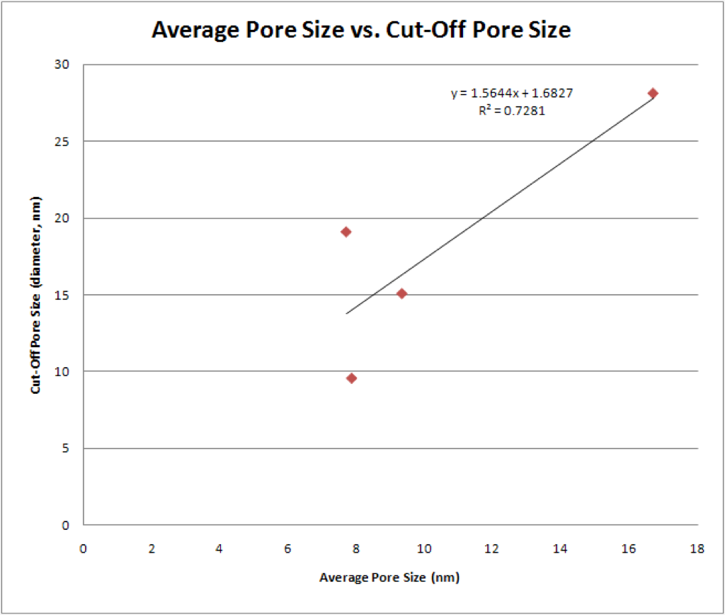
15nm, 900 RTP:
** Again, these are generally lower still.
15nm, 950 RTP:


** In general, these are right along the bottom of the data cluster.

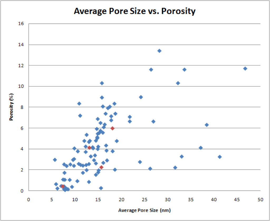
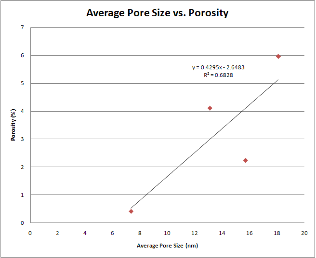
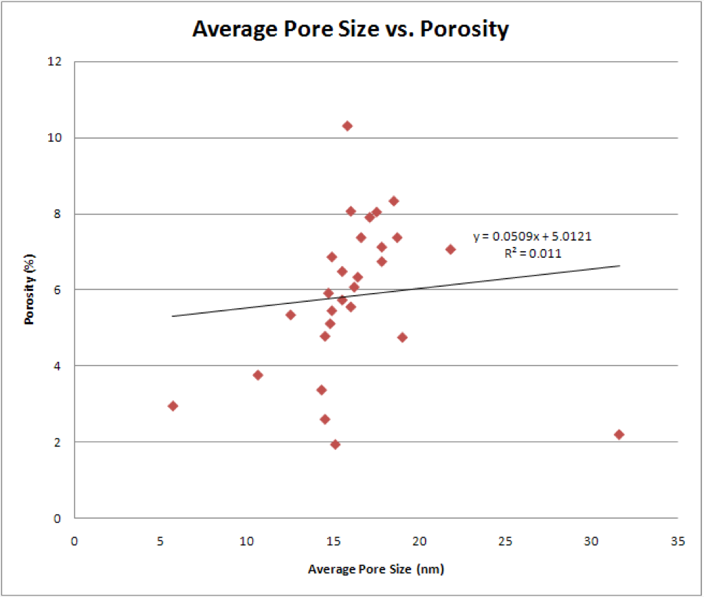
15nm, 1000 RTP:

** These really break the pattern of the first five condition sets. They are dispersed throughout the data cluster. There is even one point in the Average Pore Size vs. Porosity graph that is far off to the right.

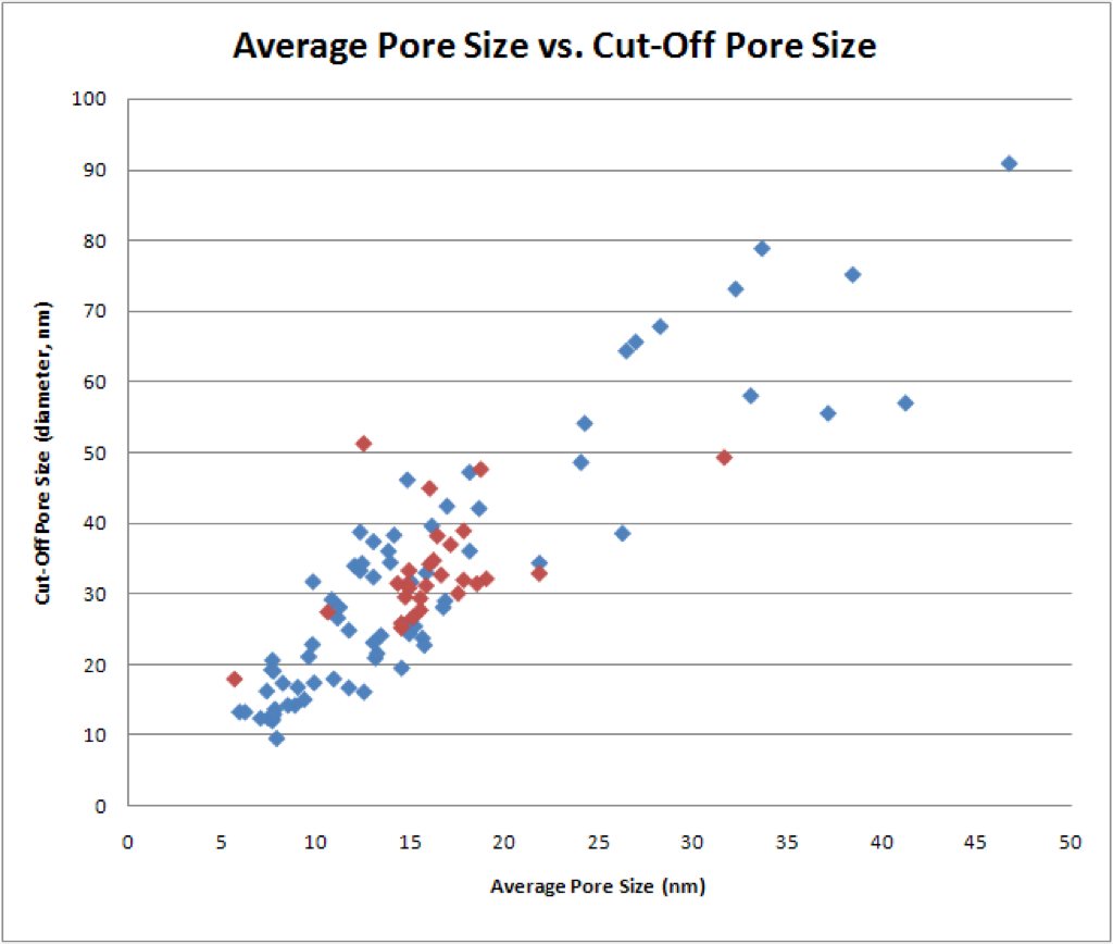
30nm, 1000 RTP:


** This is really interesting. Except for the one aforementioned data point, all the strange outliers to the right in the Average Pore Size vs. Porosity graph are in this data set (the thicker membranes).
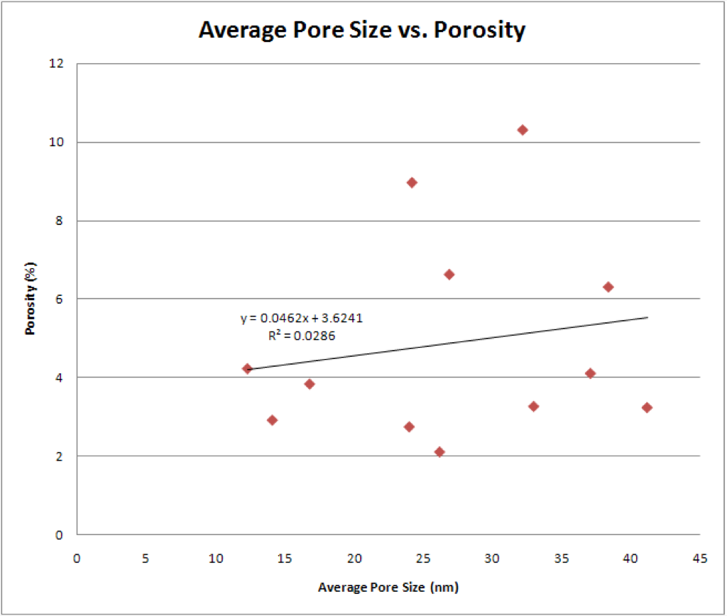

Here is a chart with to compare the slopes, y-intercepts, and R2 values of each trend line:

I really only see two rough trends here, but they seem to corroborate the assessments made after just looking at the graphs.
In the Average Pore Size vs. Porosity data, the slopes for 15nm, 700 RTP, 15nm, 900 RTP, and 15nm, 950 RTP are very similar. Looking at their y-intercepts, the y-intercepts decrease as the RTP increases. This gives parallel lines that move downward as the RTP increases, just as was mentioned under the above graphs.
Similarly, in the Average Pore Size vs. Cut-Off Pore Size data, the slopes for 15nm, 850 RTP, 15nm, 900 RTP, and 15nm, 950 RTP are very similar. The y-intercepts again decrease as the RTP increases.
RTP Ramp Rates vs. Roundness:

Here is the Excel data sheet: pore-processing-results_2


Carrie,
this is interesting, I think I can see some trends but the data is, not unexpectedly, sometimes noisy. Why don’t you go beyond sorting the data and analyze them – for example, can you get some sort of fit for each plot? or perhaps plot 2 or 3 sets on the same graph (excluding the other data points) so one can identify trends? I’d be curious to see that and read what conclusions you draw.
Philippe
thanks for analyzing the data. there seems to be useful information there and we’ll have to see whether any mechanistic model might explain what we see. One note- you fit the data with straight lines- a reasonable first step but there is no real reason to believe that the data must fall on a straight line. Can the fit be improved if another function is used?
That is a very good point. I will try different functions and see if I can get better fits.
I just got around to plotting different fit functions. For the 15nm, 1000 RTP, the best fit is an upside-down parabola. Do you think that would make sense? Or, should I just stick to linear, exponential, log, and power functions?
I’m not sure if a data fit is the best way to interpret the categorized plots. What I’m looking for is how tight the clusters are on the diameter vs. porosity plots because this tells us how sensitive the morphology is to other process conditions besides the RTP temperature. For the 1000 C RTP plots, my guess is that the lower outliers (sub-4 % porosity) are the most recent wafers that have come through with metal contamination. I’m not sure what the + 10% porous sample is though….
Carrie – can you make a plot of RTP ramp rate vs. roundness? Let me know if you need help interpreting my file naming convention…
I would not expect that any “strange” curve would produce a meaningful fit to the data. I was thinking of curves that would be a modest departure from a linear fit, such as y=x^2 or y=x^1/2.
I agree with Dave that we should definitely be careful when inserting data from different wafers on the same graph because the conditions might have changed, willingly or not.
Dave, if it helps, the + 10% porous samples are:
(15 nm, 1000 C RTP): SC b14
(30 nm, 1000 C RTP): SC b21
Are the RTP ramp rates the “1000 C RTP”, etc. values?
Philippe,
Okay.
What should I watch for when doing these graphs? Are there certain conditions or anomalies that I should label on the graphs?
Thanks!
The ramp rates are labeled “1000 C RTP XYZ Cs” where XYZ is the ramp rate.
Oops. Okay. I’ll change that.