Pore Density vs. Pore Radius Graphs
This post is a follow-up to Professor McGrath’s post, “Permeabilities vs. pore sizes for ideal membranes.”
In the aforementioned post, this equation is proposed:
Ψ = Nπr2
Where Ψ is the porosity, N is the density of the pores, and r is the pore radius.
Rearranging the above equation (assuming a constant porosity):
Ψi = Niπri2 = constant
Ni = constant / πri2
log(Ni) = log(Ari-2)
log(Ni) = B0 + -2log(ri)
In theory, a log-log plot of N vs. r should yield a line with a slope of -2. In “Permeabilities vs. pore sizes for ideal membranes,” Professor McGrath shows that w341 fits the ideal case pretty well. With Jess’ help, I wrote a MATLAB program that makes the desired graph. Now, it is a matter of seeing how many wafers actually follow the theoretical ratio of -2.
Here are five randomly chosen wafers:
SC 065:
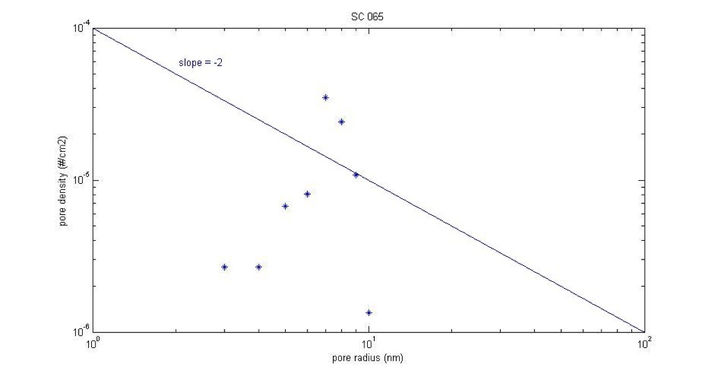
SC 065’s pores have an upward trend, with only one real real outlier.
Average pore diameter: 14.5 nm
Porosity: 1.51%
Cut-off pore diameter: 19.5 nm
Mean roundness: 0.85, STD: 0.11
Thickness: 15 nm
RTP 850
Ramp rate: 100
SC 099:
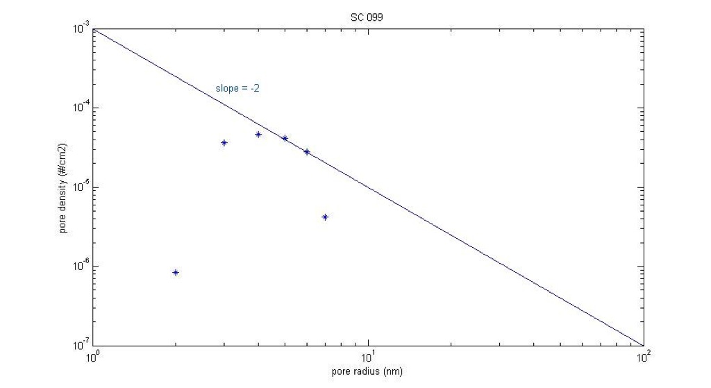
SC 099 is pretty close to the -2 line, except for one point that is pretty far out to the bottom left. Though, it is hard to tell because this wafer does not have many pores.
Average pore diameter: 8.85 nm
Porosity: 1.02%
Cut-off pore diameter: 14.25 nm
Mean roundness: 0.84, STD: 0.09
Thickness: 15 nm
RTP 850
Ramp rate: 50
SC 177:
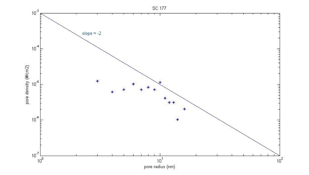
SC 177 is even closer. I just drew the -2 slope by connecting the top left and bottom right corners; it looks like the points have close to a -2 slope but with a lower y-intercept value.
Average pore diameter: 15 nm
Porosity: diameter%
Cut-off pore diameter: 31.7 nm
Mean roundness: 0.66, STD: 0.17
Thickness: 30 nm
RTP 800
Ramp rate: 100
SC 300:

SC 300 has the strangest spread of the analyzed wafers. Although, this one may have been affected by copper contamination.
Average pore diameter: 20 nm
Porosity: 5.8%
Cut-off pore diameter: 32.25 nm
Mean roundness: 0.81, STD: 0.12
Thickness: 15 nm
RTP 950
Ramp rate: 100
SC 214:
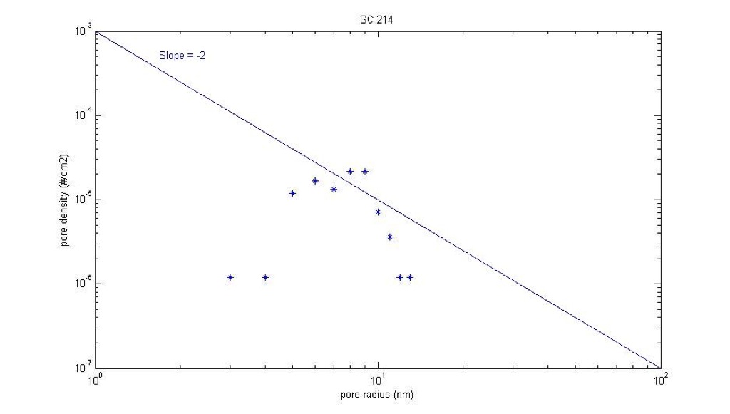
SC 214 also doesn’t have a very linear spread.
Average pore diameter: 15.1 nm
Porosity: 1.94%
Cut-off pore diameter: 26.65 nm
Mean roundness:0.81, STD: 0.11
Thickness: 15 nm
RTP 1000
Ramp rate: 100
SC 255:
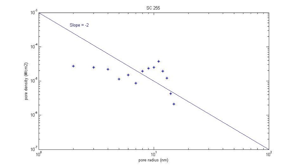
SC 255 has a better fit than most, but still not ideal.
Average pore diameter: 15.5 nm
Porosity: 5.73%
Cut-off pore diameter: 29.35 nm
Mean roundness:0.78, STD: 0.14
Thickness: 15 nm
RTP 1000
Ramp rate: 100
SC 304:
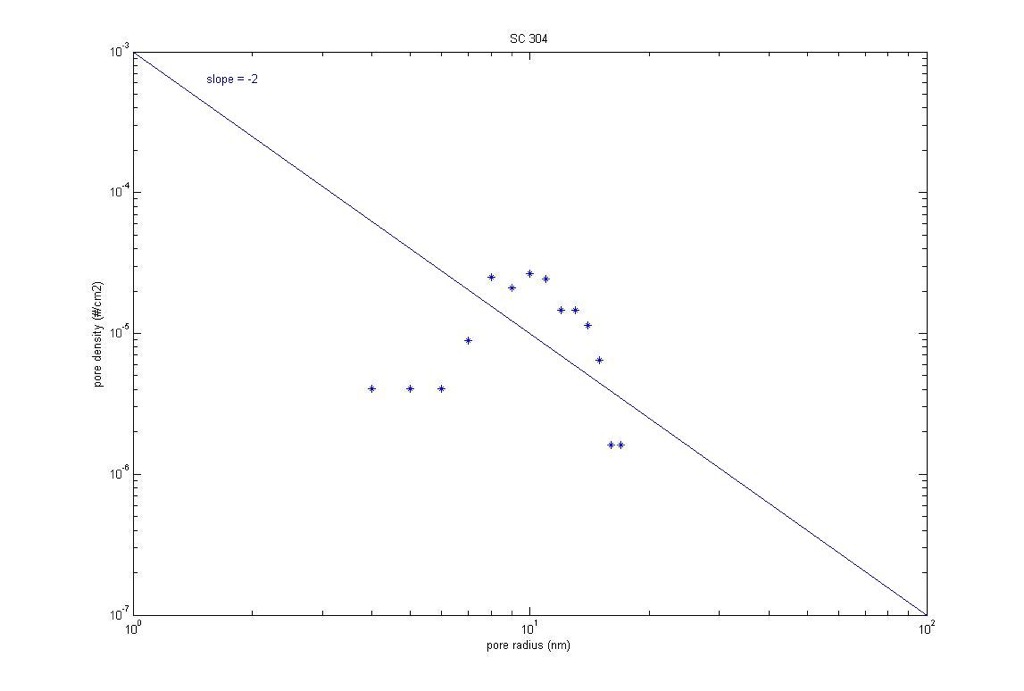
SC 304 has a better fit than most, but still not ideal.
Average pore diameter: 20.6 nm
Porosity: 5.86%
Cut-off pore diameter: 34.3 nm
Mean roundness: 0.79, STD: 0.14
Thickness: 15 nm
RTP 1000
Ramp rate: 100
Good analysis.
These plots are very interesting, but I’m confused about why we would expect a log-linear behavior. To me, it seems that a density-radii plot tells us more about what the pore distribution looks like (e.g. how monodisperse the pores are). Also, is psi really a permeability? Isn’t density*area = porosity?
Carrie, did you use the SC 215 histogram found on the photo site? It looks like some ghost pores were included in that histogram which may have influenced your analysis here.
Would you mind doing the same analysis on the following wafers? SC 304, SC 255, and SC 214. These membranes have a more “well behaved” morphology and it will be interesting to see if these follow a trend.
Yes psi is a porosity. In my long-ago post, I took an extra steps relating porosity to permeability, but Carrie’s work here is only focused on discovering an underlying relationship between pore density and pore size. Assuming constant porosity is equivalent to a flat ‘contributed area’ histogram, which we rarely see. This is just a starting point for discussion. We should think about how physics should control the relationship pore density and pore size.
I added the three you requested, Dave. I re-did the pore processing of SC 215 and I ended up just deleting the graph off this page because I thought the three you suggested were more representative.
Thanks, Carrie. What’s nice about these three plots is that there is a pattern. At the lower radii there’s a flat line but as you approach the mean it becomes parabolic. Could you send me the script that you and Jess wrote to make these charts?