Displaying EO performance
Pnc-Si membranes have a high rate of EO pumping, but what is the best way to compare to other pumps? The initial figure we used is an updated version of a figure found in a paper about alumina EO pumps (original figure bottom of this post). In this figure we show flow rate normalized to active area and effective voltage across the membrane.
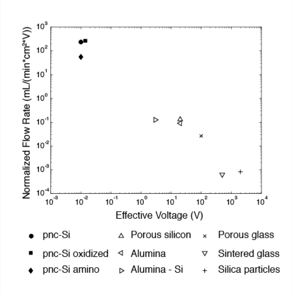
The problem with this figure is that both axis have the effective voltage and we’re not trying to show there’s a relationship between the axis. The figure is trying to show that the normalized flow rate is high and the effective voltage is low, but perhaps it’s a little disingenuous.
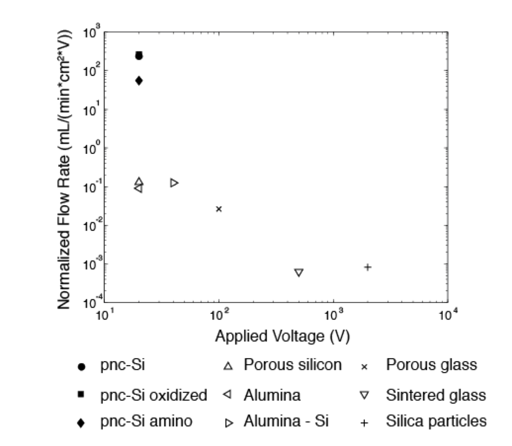
Here is another version of the figure in which the x-axis displays information about the operating voltage. This is the voltage the power supply is set to, not the effective voltage across the membrane. The operating voltage is new information, but we’re still not trying to show there’s a relationship between the two axis.
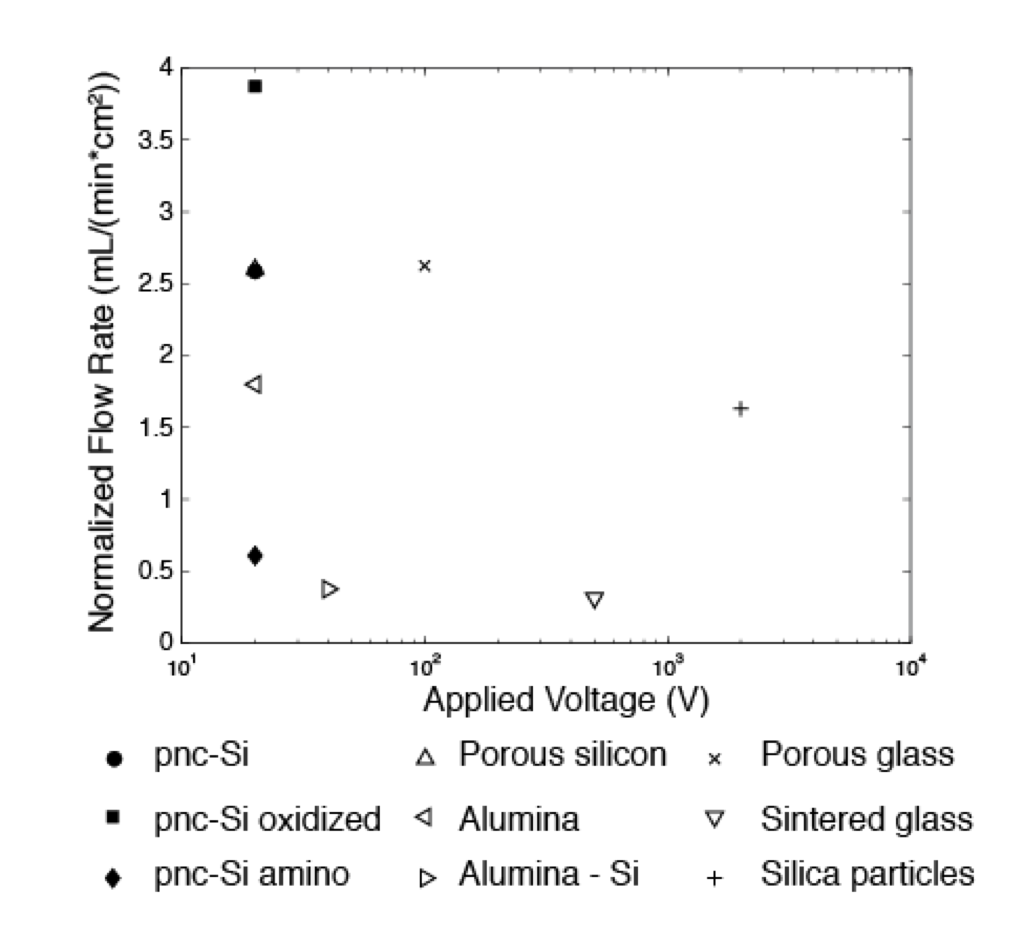
The final figure of this type is the most sincere, yet our material does not quite look as good. We plot flow rate normalized only to active area against the operating voltage. This figure does not have the wow factor the two previous incarnations did.
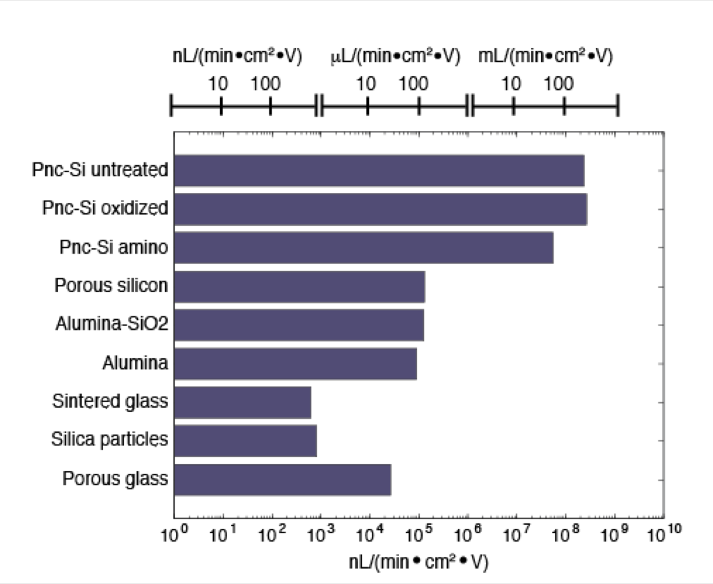
One final option is to forget trying to compare voltage and flow rate and just display flow rate. The large difference (orders of magnitude) in flow rates makes it difficult to develop a good presentation, but this bar graph might supply the right information. This also lacks a bit of the wow factor that the first chart had.