Water Permeability – Looking at the data
So I talked a bit with Philippe today about the water permeability data, and he suggested that I try to see if there’s a correlation between what the histogram looks like and the experimental permeability’s relation to the theory. I pulled out all the histograms and here’s what I could find.
Two of the membranes in which the theory is greater than the experimental data have bimodal distribution. There are a lot of little pores in the histogram and a clump of larger ones. So maybe those little ones are not really through pores in this case?
One membrane that has higher permeability than the theory has histograms with a background of little pores and one or two big pores. Maybe we’re really underestimating the active porosity because our images are only capturing a couple of the active pores each time.
w415 has the highest permeability yet and a somewhat normal distribution, but I’m not sure why the theory is so much higher in this case.
Finally I can’t explain the enormous permeabilities from w504. This was the wafer that gave Tom flow in the wet/dry mode though.
Here’s my diagram:
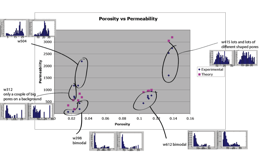
Great suggestion Philippe.
w504 was also the membrane that gave Tom the wet/dry flow phenomenon. I think we need to call this wafer anomalous.
I was a little dyslexic about the cigarette burn thing, it was 205 not 504 that was the only one out of a series to be unaffected. It does make sense that 504 was Tom’s anamolous wafer though.
The 602 data on this figure looks like it is actually from the permeability studies on 612. Is the histogram right, because it looks different than the histograms Karl had in his post for 612.
You’re right, that should be 612 in this figure.