Gel Densitometry with ImageJ
This is the protocol I use to measure band intensities. At the end of the explanation I will post and review my recent results concerning silver stain densitometry. First load a digitized gel into ImageJ Select Image>Type>8 bit to make it black and white. Select Invert to make the bands have positive intensities. Go to Analyze>Set Measurements and select Mean and Mean Gray Value. Using the Freehand Drawing tool, outline the band to be measured. Type m to save measurements.
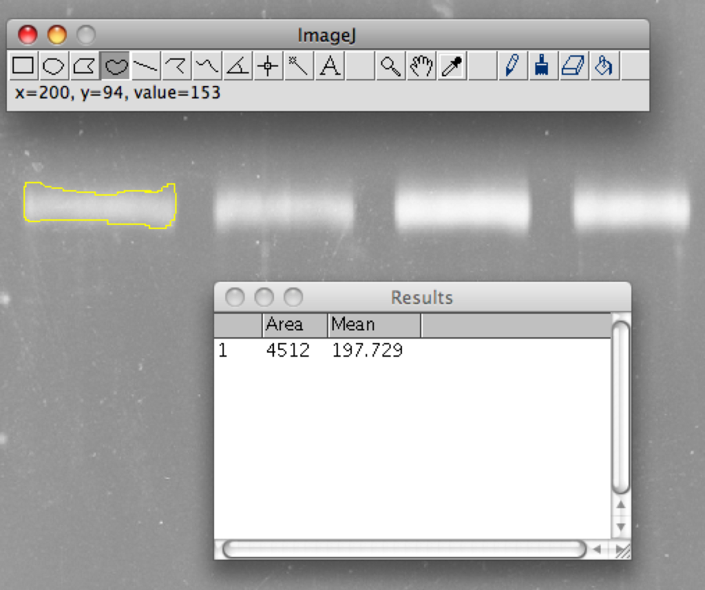
Now draw around a small piece of the background near the band. Again press m to record the measurment.
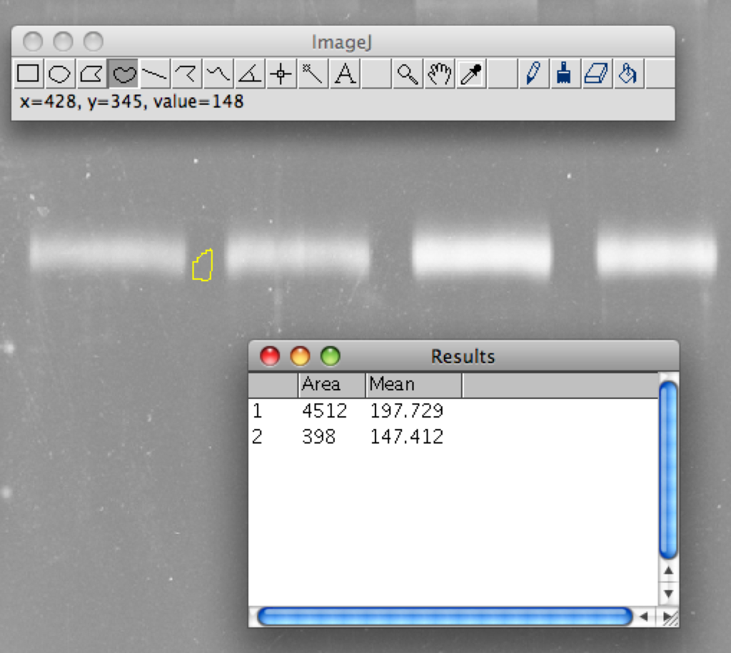
To get the band intensity simply subtract the background mean from the mean intensity of the band. Multiply this value by the area to get the normalized intensity density. Recently I ran a gel of decreasing BSA concentrations to test the linearity of silver stain.
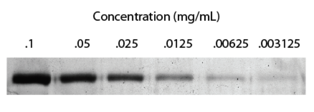
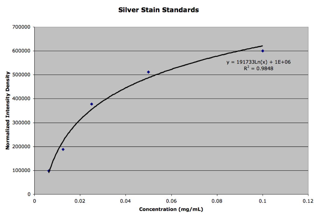
Using the above method I obtained the following plot from the analyzed gel. It looks like silver stain follows a logarhythmic trend, although the first few points seem pretty linear. Either we try to keep our concentrations in this range by dilution or attempt to fit to a log curve
Nice Jess – This belongs on the Protocols page. Can you add links to ImageJ download sites please.
Are these images acquired by backlighting the gel, or simply scanning or taking a reflective picture? With backlighting, I could see a potential for linearity, but for normal lighting, the physics are far more complicated due to scatter and it is unlikely to be linear by my intuition. Seems like you should have more dynamic range as well with backlighting. It would be worth trying if we are serious about quantization.
Be careful about pixel saturation or I guess the dark equivalent. The two highest concentration bands look saturated to me – in this case, this means hitting the dark noise value. If you look at the intensity histogram, these bands are not Gaussian, a signature of this effect. Coincidently, these are the two bands that kill you linearity, as expected. It’s important that the exposure time is set to ensure that there are minimal saturated pixels in the brightest (darkest) band. Exposure time should have reasonable linearity, so several images could be taken at different exposure times to broaden your dynamic range, if necessary. This is a little trick when your data is darker than background, as most people are used to looking for data as bright regions on a dark background. Still I think the linearity is much better than you last graph implies.
The images are taken using a backlight with a standard gel light box.
I agree with the saturation too. The first three points on that plot are more or less linear, while the last two, which are the two darkest bands on the gel, begin to saturate.
I think the plan is to keep the samples we are measuring within that linear range by dilution.