Sepcon Macro Update
The older sepcon macro has been update to fix previous issues and yield more meaningful results. These updates are being brought up to get feedback from the group and from there implement them and make these changes to the newer sepcon patterns and eventually the TEM patterns.
Gathering and analyzing statistical data is standard practice in industry. It’s used for process control to determine the effects of changes in the process or deviations in your process. Statistics will also aid in future DOE endeavors because currently there are a lot of process variable data but no results to determine trends. Even with results, we have to understand where they come from before decisions are made because results might have assumptions which can be misleading.
An overview of the sepcon macro on how to input data and get results will be shown. Below is an image if the data input screen.
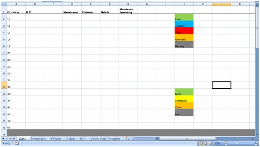
For the B.P. column, only enter in numbers. Depending on the number you enter, it’ll change color. < 3 is yellow and >3 is green.
For the membrane column, there is a drop down box with 5 choices. Pick one of the 5. Please fill in for every position.
For the Pinhole column, enter any whole number. Please enter for every position except when the membrane is torn, unetched or missing. When you run the macro, it’ll convert the corresponding entry of pinhole to NA for torn, unetched or missing.
For the debris column, pick any of the 4 options. You can leave the NA alone if the membrane condition is torn, unetched or missing. It’ll go through it to change it in the macro.
So let’s take a look at it when it’s filled out. Below is data from SC025 from B2 to F18.

Notice how the data from Nakul doesn’t correspond to what the macro likes. B.P. data will be edited to only have the #. Membranes will be put into 1 of the 5 categories, pinholes will be given just a number and Debris will be given one of the 4 conditions. The next image shows the edited data.

Notice how everything has a color when it likes the data you entered (for the most part). I’ll do this for the other quadrants too. Afterwards, let’s look at the membrane sheet with the macro run.

To run the macro, click on the draw button. If any of the boxes in the wafer map is white, then the data for it is missing. Go back and put something in there, it has to be one of the 5 possible options. Notice the statistic table. It gives the total count of each membrane condition. The percentage of intact membrane is also given. This tells us the yield of the wafer. The calculation for that is:
(# intact – # wrinkled) / (# intact + # wrinkled + # torn + # unetched)
This is so that it doesn’t take into consideration any sepcons that aren’t there. Looking at the wafer map, we can see what’s going on with the membranes and potentially determine what could be causing certain membrane conditions. Now let’s take a look at the pinhole sheet.

The pinholes are placed into 3 categories. This is opinion based where 0 pinholes is green and 1-5 are about just as bad and anything more is bad. A statistic table shows the amount of samples in each of the 4 categories and there is also a total count of pinholes of the wafer. A % with no pinholes is also determined as a yield analysis. This is calculated by:
(# with 0 pinholes) / (# with 0 Pinholes + # with 1-5 Pinholes + # of bad samples)
The NA is samples we don’t consider at all. Pinhole density is also calculated. This will vary from different mask design due to different active area. For the older sepcon pattern, the active is assumed to be 100um x 2000um. The equation for pinhole density is:
(Total Pinhole)/[100um x 2000um x (# with 0 Pinholes + # with 1-5 Pinholes + # of bad samples)]
Now let’s look at the Debris page.

It’s pretty similar to the other two pages. Let’s look at the final page, Burst Pressure (B.P.).

Press the update button to run. The first graph shows B.P. vs Radial Distance. A colleague believes there a trend for this data. We’ll see. The second graph is B.P. vs Pinholes.

From this we can clearly see how B.P. varies with pinholes. 0 pinholes definitely showing high burst pressure.
This concludes the macro run through. From here, hopefully we can implement a similar results analysis and put critical numbers onto a list to view trends throughout the processing.
